
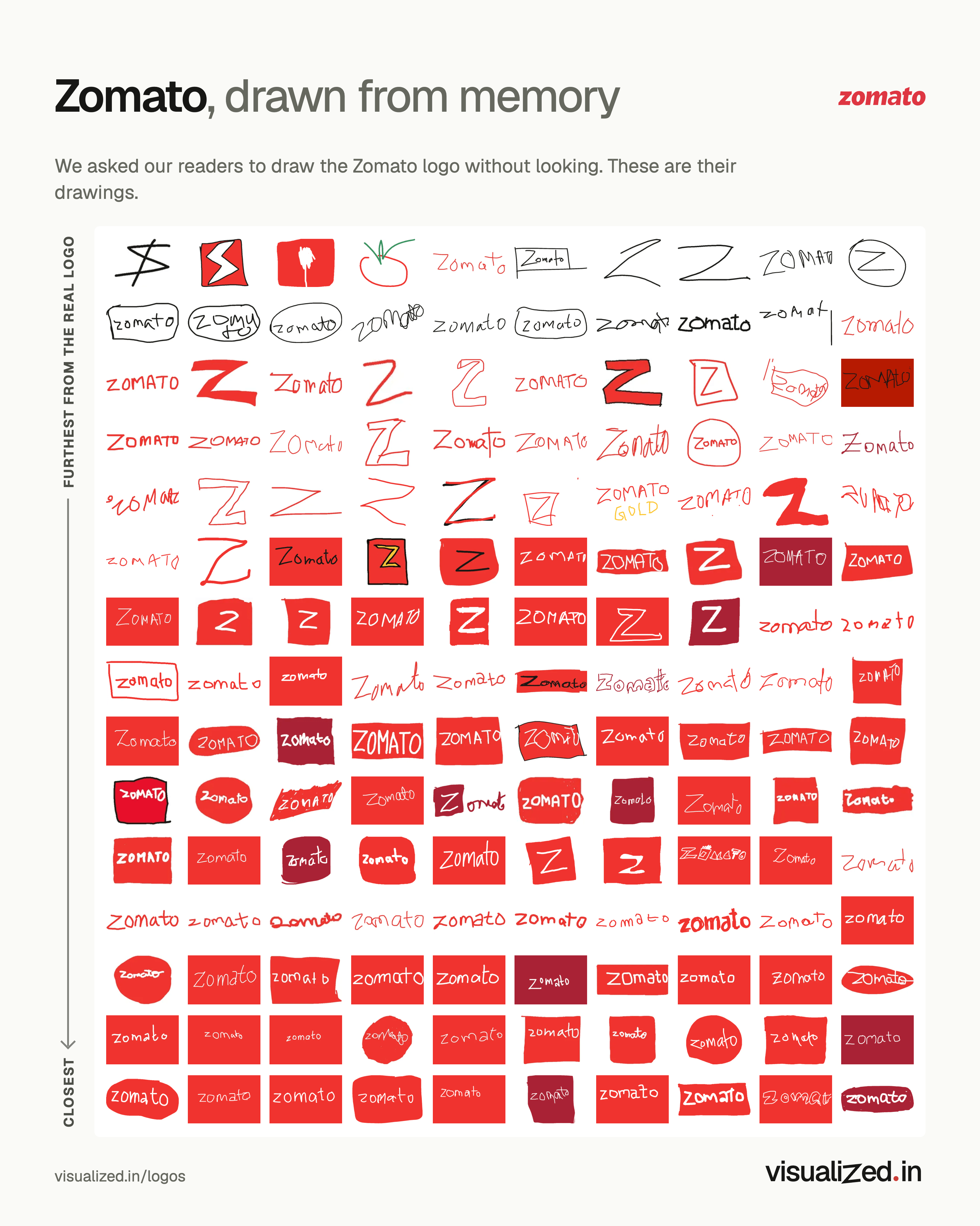
What our readers remembered of Zomato
Zomato’s name in lowercase letters came back in two colourways: 50% drew white letters on a red box and 38% red letters on white. 15% drew just a big Z.
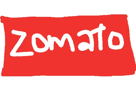
50%drew white letters on a red box
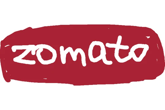
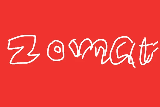
38%drew red letters on white, like the real logo
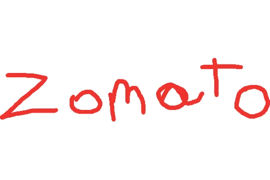
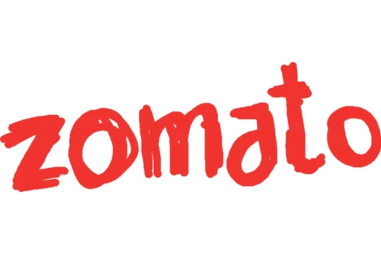
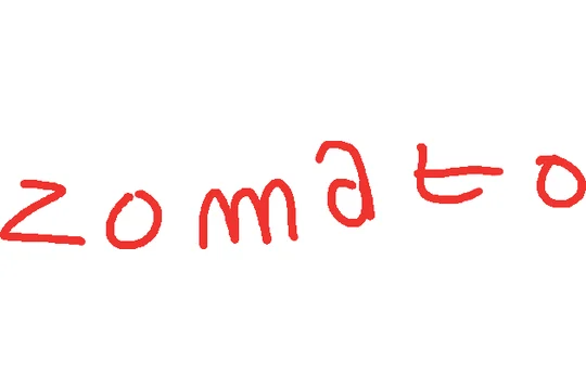
15%drew just a big Z
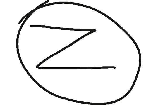
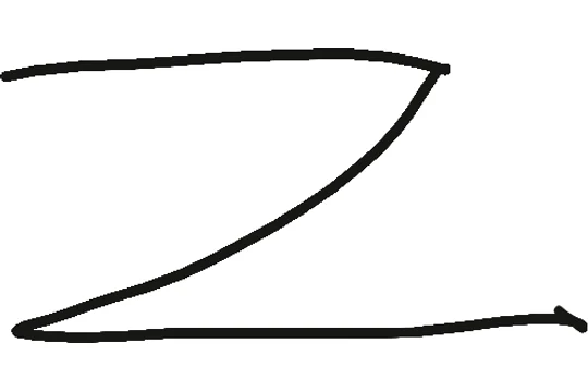
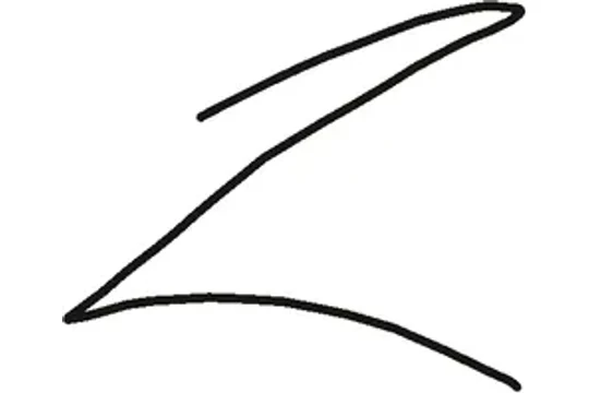
Honourable mentions
Not close, but memorable.
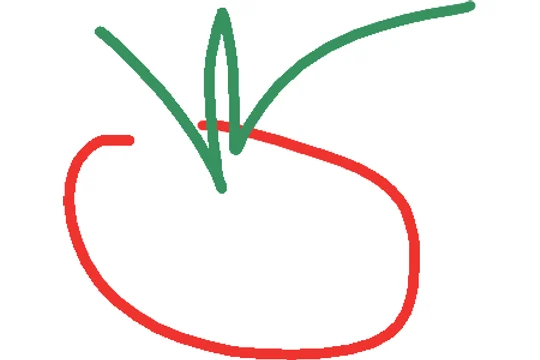
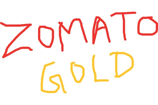
How close they came
Every drawing, sorted into one of seven groups. 50% nailed it or came close.
- Close50%
- Half-remembered35%
- Just the name10%
- Something else2%
- Drew a picture<1%
- Gave up2%
The colours
88% of drawings used the logo’s red. Leaving out black, the default pen, the colours used most were red and pink.
By age
Younger readers did better. 53% of drawings by under-25s came close, against 44% by readers 25 and over. Older readers were more likely to write just the name: 14% of their drawings, against 7%.
Shares are of all 304 drawings of Zomato, including blank ones. The image shows 150 of them, picked to cover the whole range. How we judged them → The idea comes from Signs.com’s Branded in Memory.